TOWN & COUNTRY SURFACES WEBSITE REDESIGN
Tools and Skills: UI/UX, Brand Development, Wireframing and Prototyping in Figma
About this Project
As a Design and Operations Intern for Town & Country (T&C) Surfaces, one of the projects I led was redesigning the company’s website. Upon first visiting the website, it was unclear to me what T&C is, and I ran into several friction points with its UI/UX. In order to address these communication and design issues and to integrate new features into the website, I assisted with brand development and created a wireframe in Figma with a functional prototype to illustrate the changes I proposed and to demonstrate their functionality.
HEADER & NAVIGATION
When first exploring the website, I immediately noticed some redundancies and challenges that directly impacted the layout of the navbar.

Original Navbar: Materials and Stocked in the USA navigated me to filtered views of the Products page, which could be condensed under a singular filter function. Additionally, the Order Samples page, the main call-to-action on the site, was hidden away in the top right corner, which made it seem less important than the items listed in the navbar.

Proposed Navbar: I suggested that the Materials and Stocked in the USA pages be removed from the navbar. I also proposed a Gallery page where T&C could highlight big projects and include other features such as a Blog or Design Inspiration. Furthermore, I switched the placement of the Contact and Order Samples pages, and for consistency, condensed “Order Samples” to “Samples.”
In testing, we found that this new navbar layout made the site much easier to navigate since it is less redundant and each of its elements has a distinct function.
HOME PAGE
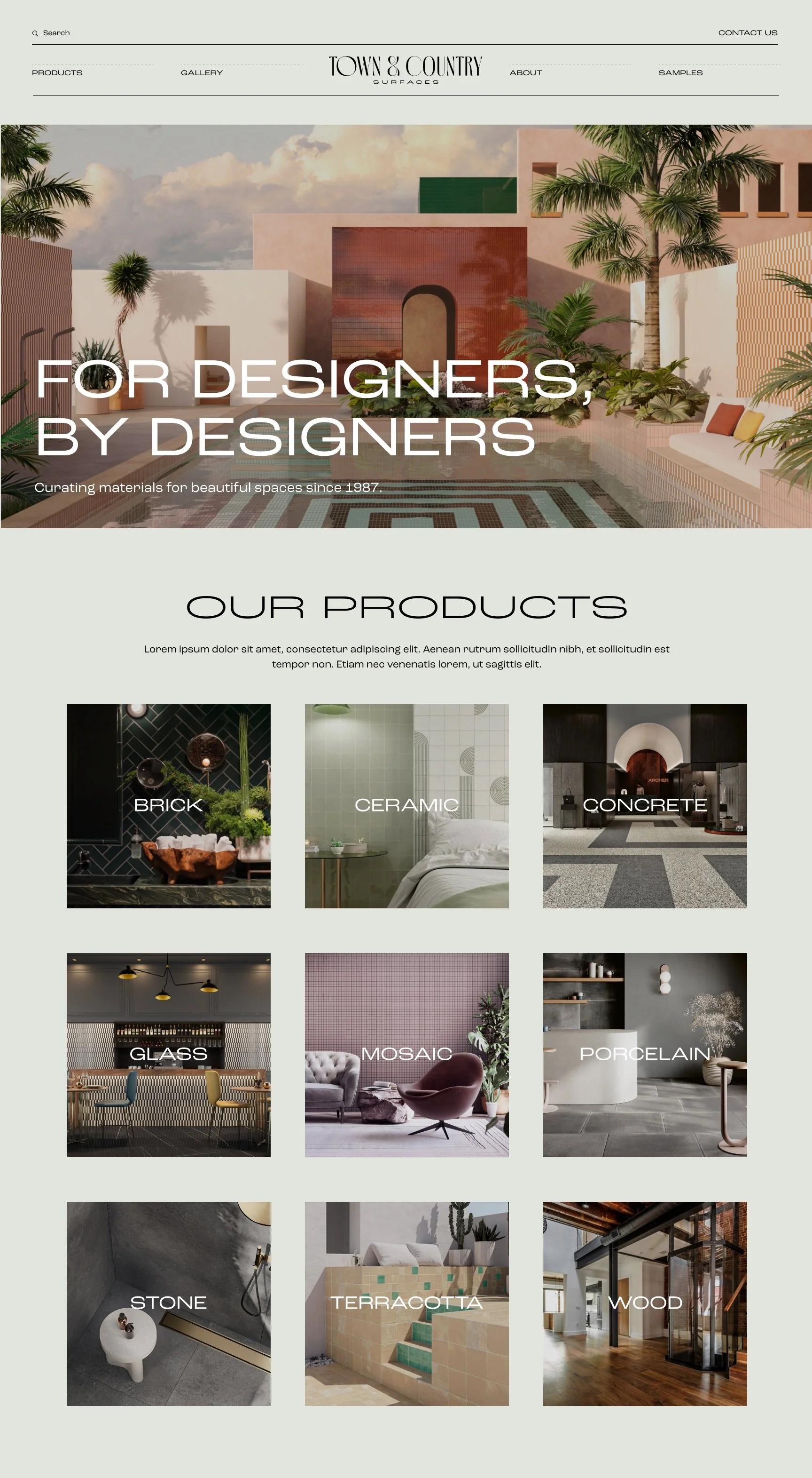
Originally, the Home page was one long list of featured collections, and it didn’t specify the type of products T&C carries, its work, history, or its distinguishing features. I wanted all of this information to be immediately accessible to the user, so I proposed a new layout for the Home page:
Intro: In brand development, I suggested that we come up with a one-liner that encapsulates T&C’s value proposition and highlights its history and connection with its target audience. We ultimately decided on “For Designers, By Designers; curating materials for beautiful spaces since 1987.”
Products: I thought that it was important to put all of T&C’s products up front so that users immediately know what T&C has to offer. Also, it provided the opportunity to highlight T&C’s lesser known products and to showcase some of its beautiful imagery.
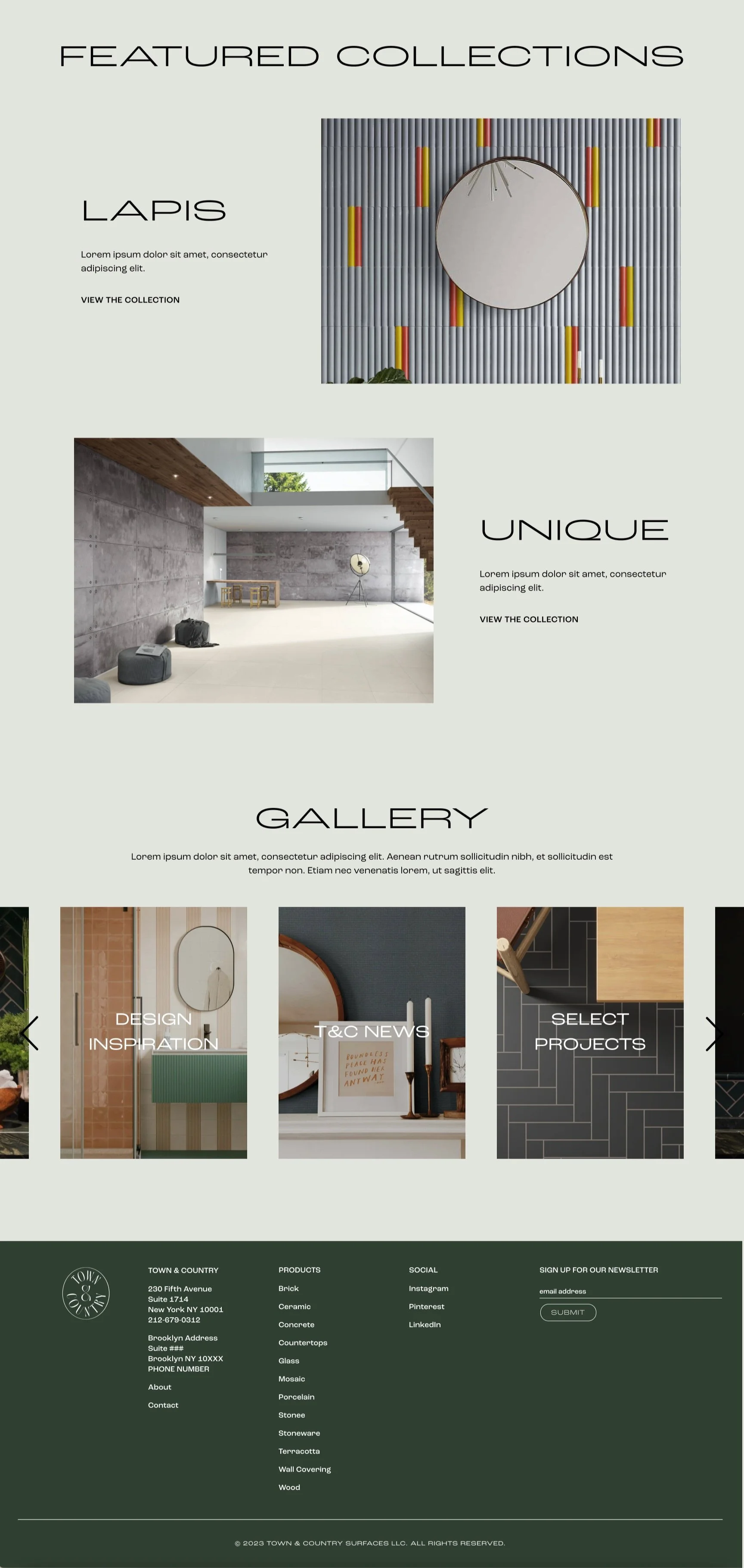
Featured Collections: This section is a condensed version of the original Home page — rather than listing 10 collections, it would only include up to three to truly distinguish this select few.
Gallery: While the Gallery may not be the main reason why a user visits T&C’s website, it is still an important feature to have on the Home page. The carousel limits this section’s area while allowing the user to view all the album categories at their leisure.
PRODUCT NAVIGATION
The filters on the Product page were not very well organized, contained too many options, and were difficult to remove once applied. As a result, it was inconvenient and overwhelming to navigate through products.
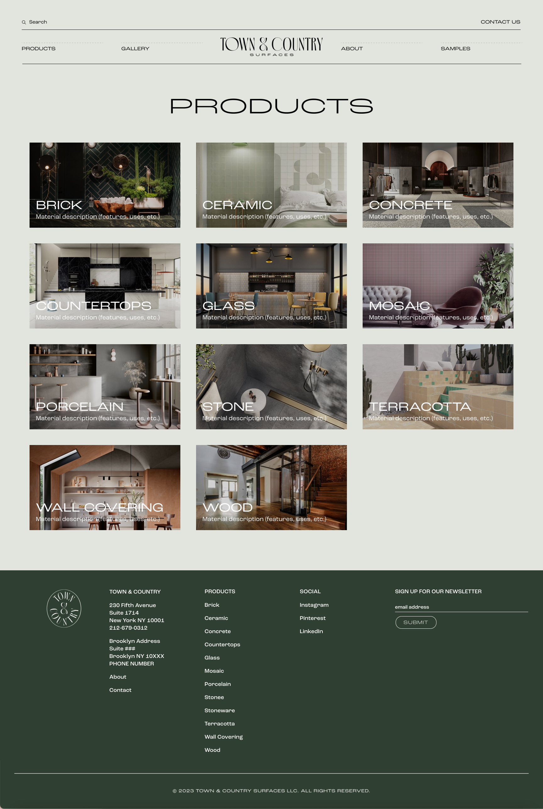
For more comprehensible UX and consistency with the Home page, the proposed layout for the Products landing page is also organized by material. Each material has its own page that lists all of its relevant collections. The user can toggle on “Stocked in the USA” and filter the collections by color, finish, application, and look. They can also easily view which filters they’ve applied and remove them using the “Filters” navigation above the list of products.

ORDERING SAMPLES USER FLOW
Ordering samples via the website is one of T&C’s primary opportunities to acquire new customers. In order to do so, users would have to fill out a form under the Order Samples page. The biggest friction point in this form was the “Samples Needed” section shown below, in which the user would have to manually record the corresponding T-code, collection name, color, and finish of each sample they wanted to request.
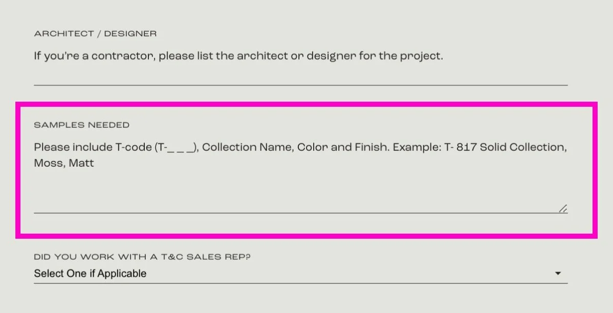
While this may not be as much of an issue for users ordering 1-2 samples, most clients request 10+. Furthermore, sometimes the information provided by the user is incorrect, which makes it difficult for the Samples Team to put together an order. Therefore, I suggested that new functionality be integrated into the site to address this issue:
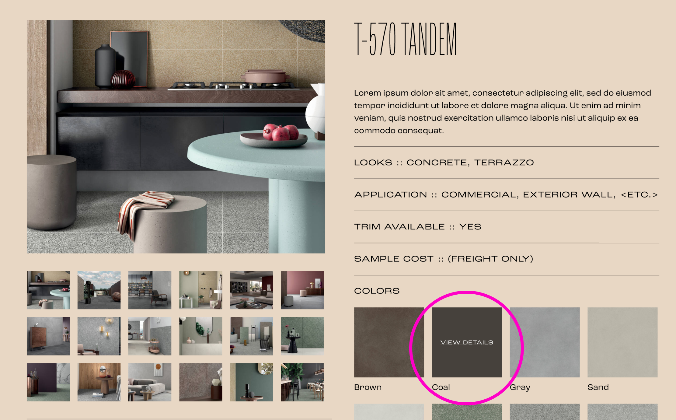
1.
Upon finding a product they are interested in, the user can hover over the corresponding image and click to “View Details.”
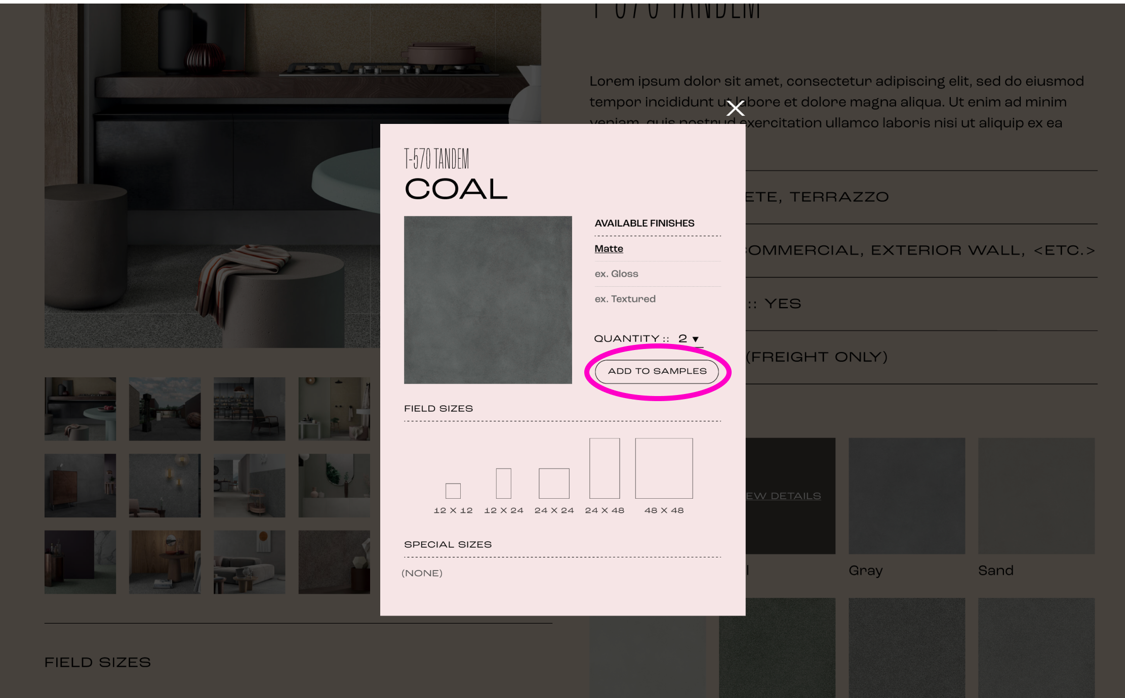
2.
In the Detailed View overlay, the user can select the desired quantity of that sample and add it to their list via the “Add to Samples” button.
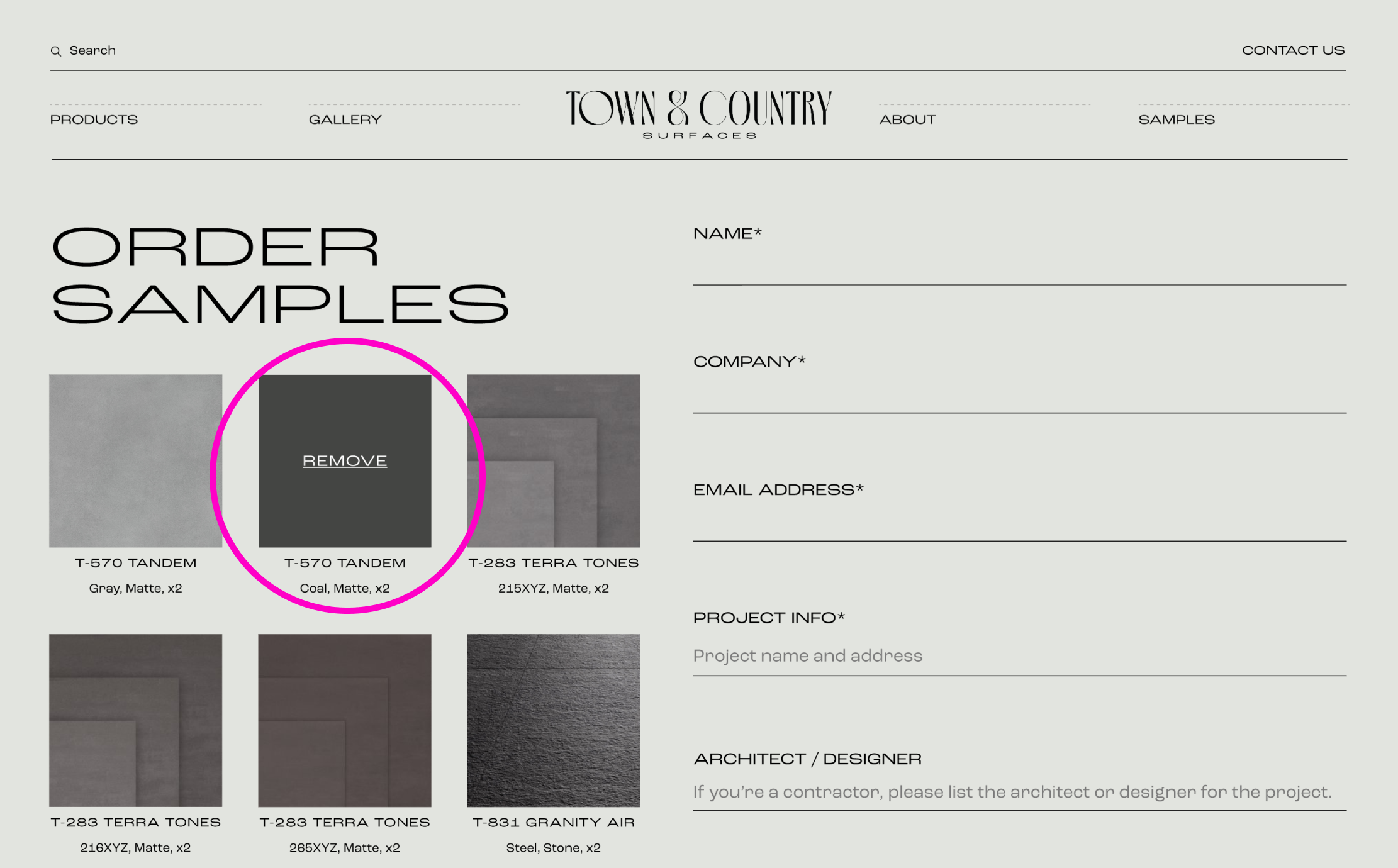
3.
On the Samples page, users can find their added samples listed beside the form. They no longer have to manually record any product details.
When the user submits the form, all of the information needed by the Samples Team is automatically recorded in the request. This would eliminate any potential for confusion about the items that the client wants and would make assembling orders a much faster and smoother process for the Samples Team.
GALLERY PAGE
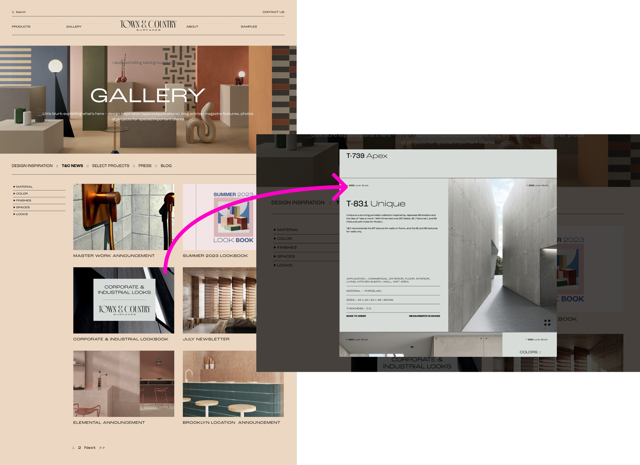
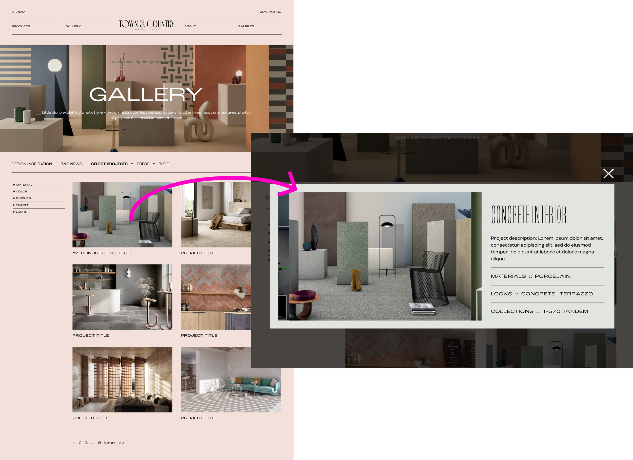
To feature T&C’s work and features, I proposed a Gallery page. The content would be organized in “albums,” such as Design Inspiration, T&C News, Select Projects, Press, and Blog. Similar to the Products navigation, the user can filter the content according to the criteria they desire. Content that isn’t already included elsewhere on the website, such as Lookbooks, newsletters, feature articles, or photos, would be presented in an overlay as seen below:
ADDITIONAL FEATURES & UPDATES
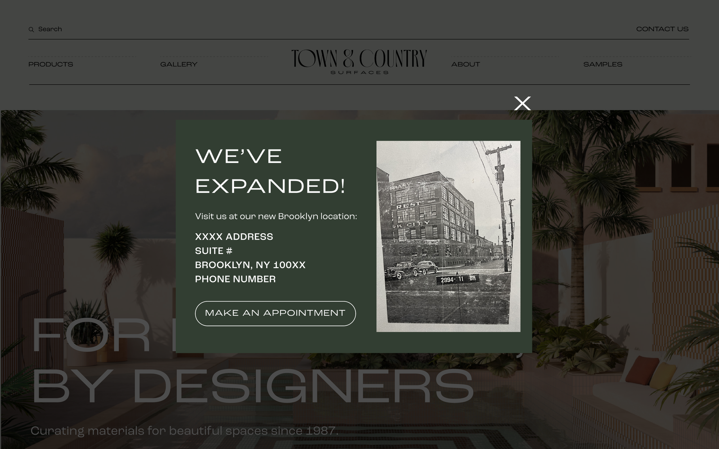
News Overlay: Upon first visiting the site, the user is greeted with a pop up that shares T&C’s most recent news and includes a relevant call to action. This example announces T&C’s expansion to a new location and provides the user with the opportunity to “Make an Appointment” to visit.
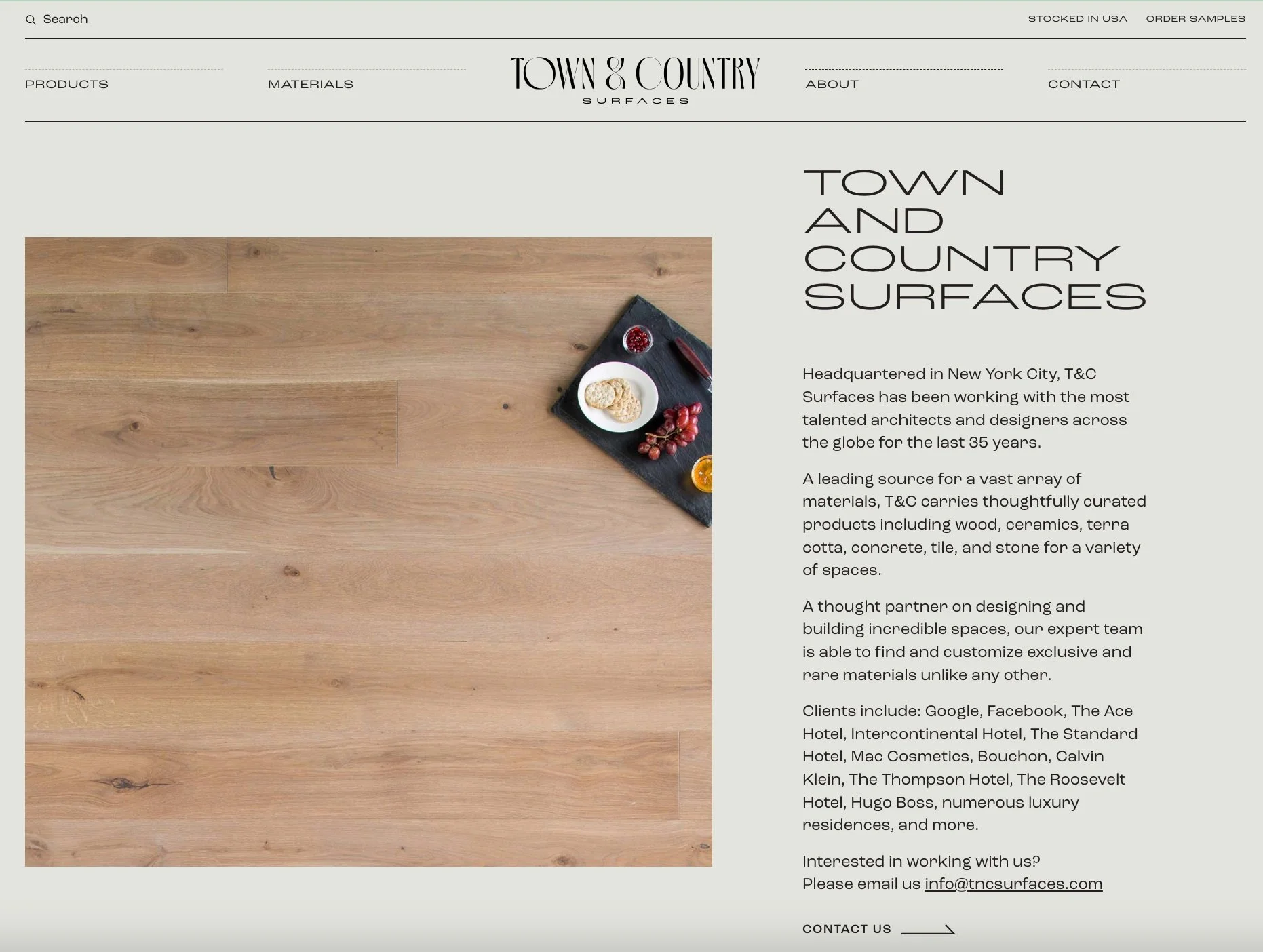
About page: The original About page mentions some very prominent clients with whom T&C has worked with, and the only imagery it includes is this wood flooring. I thought that the About page would be the perfect place to showcase some of T&C’s best work.
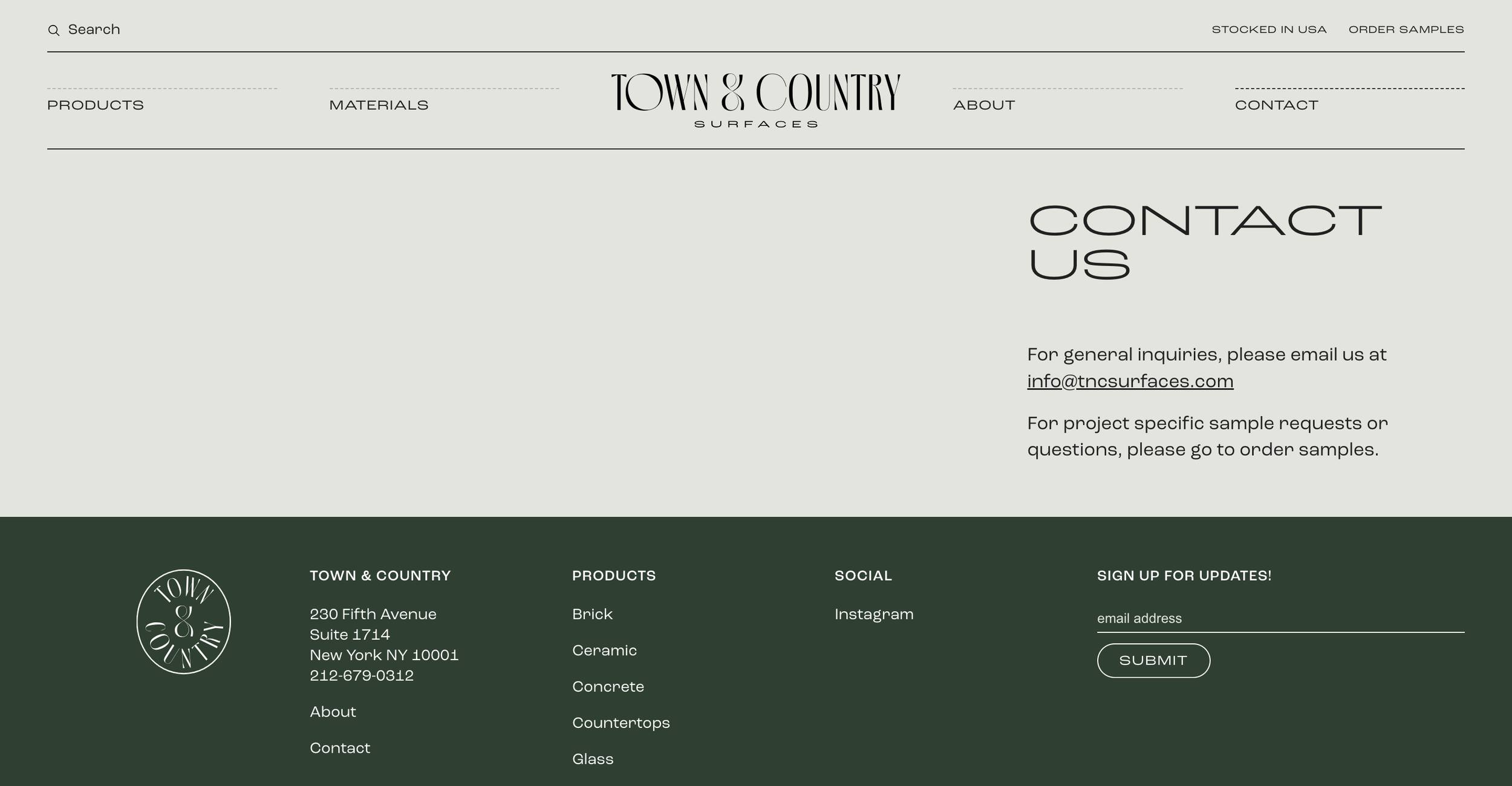
Contact page: I thought that the original Contact page needed some love. With T&C’s expansion to its second location, it became essential to list the company’s operating hours and to integrate a formal scheduling feature for clients who would like to visit one of the show rooms.
Original About Page
Original Contact Page
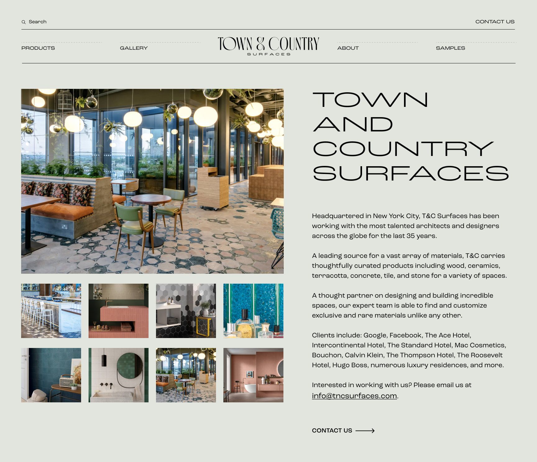
Proposed About Page
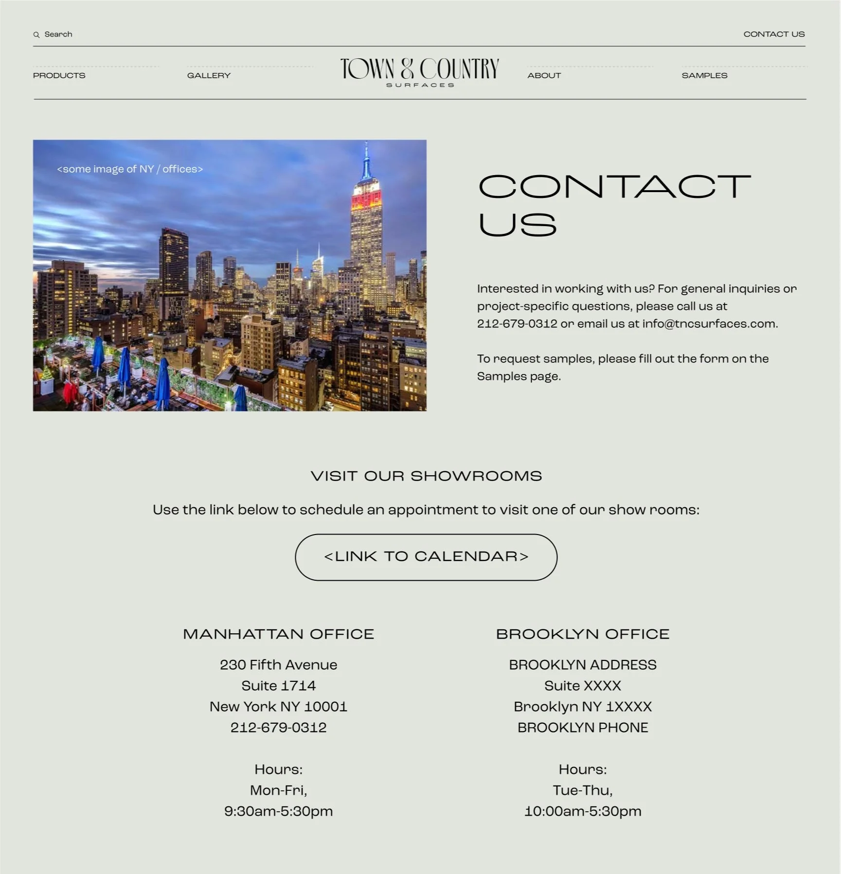
Proposed Contact Page